Writers love words. We love to use words to bring people into a scene, to describe, and to illuminate. Many of us would like to think our words speak for themselves. Any header art our editors might demand is gravy.
But on the Internet, an image really is worth a click-through to those infamous 1,000 words. As more and more readers navigate to science stories via social media, they are getting there based on the image and the headline alone. Science comics and infographics routinely go viral. In some ways, it is a better time than ever for science art to flourish.
Unfortunately, journalism budgets are often tight, and deadlines are tighter. There’s often very little time or money to pick the perfect, scroll-stopping image to go with your story. But that doesn’t mean you need to give up. Glendon Mellow, a freelance science artist who wrote about image art for Science Blogging: The Essential Guide, blogs at The Flying Trilobite and Symbiartic. Here, he talks with Bethany Brookshire about the many roles of science art in the Internet era, how writers’ thinking about art has evolved, and what it takes for art to pull its weight in attracting and engaging readers.
What role do you think science art plays in science writing and science communication?
In a really simple way: It’s good marketing to have an image. We’re visual creatures.
When you go to the supermarket and there’s magazines there, none of the magazines have only text on the cover. There’s always a picture to catch your eye and pique your interest.
Online, everyone’s attention can go in so many different directions. There’s so many links and so many tweets to look at, all that visual noise. You want to have an intriguing image. And if you’re someone who enjoys learning about new discoveries in paleontology, the quickest way to catch your attention is to put a dinosaur somewhere.
A really good image can also change how a writer tells a story. I read [once] about a sense organ in large whales. It’s about the size of a beach ball, right in the middle of the lower lip—scientists think it’s part of how they lunge-feed. This is something where a visual comes in handy. It’s a starting point for anyone to grab on to. If someone says they discovered a new organ in a whale, my first reaction is, “I want to see what that looks like!” And hopefully the illustrator made the organ orange and easy to see.
Having an effective image also helps take some of the heavy lifting off of the writer, a picture being worth a thousand words. It also takes some of the work away from the busy, Internet-skimming reader by breaking up the text and by giving form to something they would otherwise have to imagine. Saying, “a new dinosaur species a little taller than a velociraptor with a rounded muzzle” is not as effective as a paleoart illustration. And in my mind, an image can be effective in two different ways. At its simplest, it may clarify something complicated, like a medical illustration depicting the use of a new medical device without all the viscera that a photo would contain. Or it might artistically evoke a sense of mystery about a puzzle researchers are trying to solve—say, a painting of a puzzle with the only assembled pieces being the fossil bones actually discovered and the rest of the creature’s form left a mystery. An effective image can usually either explain to or entice the reader faster than prose.
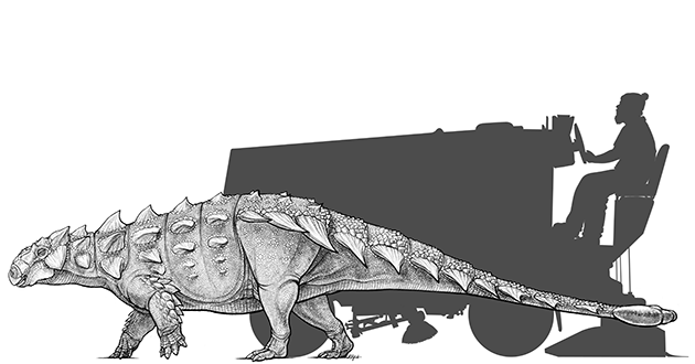
It also becomes a form of branding—and not in a bad way. Branding is a successful way to communicate a clear message and a sense of ownership over something. I like what the people at the Royal Ontario museum have done. They have a really fantastic illustrator on staff there named Danielle Dufault. She did the illustrations for an ankylosaur they announced, named Zuul. Next to it, they put a guy driving a Zamboni—but not just a guy; he’s got a beard and a man bun. They had some fun with it. Those images of the hipster driving the Zamboni get shared, and it becomes a form of branding.
How do you think the overall quality of science art and readers’ expectations for it have changed in the era of the Internet?
I think the quality of images has gone way up. It’s not just a matter of more knowledge and accuracy—it’s also that our tools are better. You can erase things more easily. You can experiment more than you could with traditional painting. I think the effect that has on the reader is [that] their expectations for good work are really high.
Have writers’ attitudes toward art in their stories evolved?
Writers are the worst.…
I’m just kidding!
Right now art is “extra” work for journalists. They’re working on the writing, talking to the source, getting everything squared away and dealing with edits. But art isn’t extra work—it’s essential work. The images can’t be an afterthought; they need to be front and center, part of the story from the beginning.
I think there’s a curve to how science writers think about art. I think when they start out they aren’t worried as much—they’re focusing on what they want to develop, and that’s the writing. Then they start to get more traction with images. Because the right images will take a message much further. The funny thing is, once they get to a certain level and are being published regularly by a major publication, they think about it less. They’ve got editors saying, “Here’s the photo we’ve asked for.”
I will say that most of the people I know or speak to regularly that do work at large publications are quite diligent about [art], and do see it as part of their story now. They’ve seen the power it will have to make or break their story or send something viral. I think the better a journalist gets the more they are aware of it.
What do you wish science writers would think about when it comes to art and illustrations for their work?
There’s two things I think complement each other.
The first is don’t just pick an image that’s immediately impactful. Make sure it’s actually an image that says what you’re trying to say. The easiest example that I immediately think of is vaccine imagery. It’s easy to get art of a screaming child with a doctor there, or blue-tinted sort of ’90s-music-video images of a needle. It’s easy to get those kinds of art, and yeah, it’s about vaccines, you can throw it on your work.
But it’s undercutting the message that vaccines are safe, that they’re necessary for populations if we want to thrive. [Depicting] a screaming kid is shooting yourself in the foot. More and more outlets are starting to realize this, and starting to pick something that is appropriate.
The other thing [is that] I would like to see whoever’s picking the image for an article look beyond the obvious one. It’s important in some circumstances to be clear with your picture, just like you’re trying to be clear with your writing. A lot of science writing is writing about concepts for a public that may not understand everything, so you’re trying to be simple and clear.
But visuals don’t always have to be. What I’d like to see in more popular science journalism is more fine-artsy things that are evocative and bring out an emotion in a person—that gets them to want to read an article. Not just something that’s clear.
I think of the work of John Conway, a paleoartist. John’s amazing. When he sits down to paint a dinosaur, he works at being scientifically accurate—certainly he’s much more accurate than I ever try to be. But when you look at his pictures, they’re also moody and atmospheric and very beautiful in the way they are composed. Sometimes the artistic element threatens to overtake the scientific element a little; he’s right on the cusp sometimes, and I love it. He treats dinosaurs like they’re this newly discovered thing, every time. He’ll have images where the painting is overwhelmed with giant magnolia trees and when you look closely it’s not modern animals under the tree—it’s little feathery dinosaurs.
I think a lot of the time on magazine covers, they’ll have, for example, a picture of a very realistic artist’s rendering of Titan and one of the probes going around it. It’s all very crisp and done digitally, which is fantastic for making something like a probe. But it’s sort of the equivalent of a medical illustration. It’s lacking a bit of artistic poetry. I’d like to see editors get a little more creative in incorporating [more artistic pieces]. I think it would draw people to the stories.
Follow Glendon Mellow on Twitter at @flyingtrilobite and on Instagram. His art is available at his site and he blogs at Symbiartic.
Bethany Brookshire is an award-winning science writer at Science News and Society for Science & the Public. She runs the Scicurious blog and is the web producer and social-media manager for Science News for Students. She is one of three editors of Science Blogging: The Essential Guide (Yale University Press). She is also the guest editor of The Open Lab Anthology: The Best Science Writing Online, 2009. Bethany is based in Washington, DC. Find her at her website, or follow her on Twitter @scicurious.