It’s tempting to proclaim that visual languages are more universal than spoken and written languages, and that the very act of presenting information in the form of a drawing instead of words makes it more accessible. But that’s not necessarily the case. Visual jargon, for example, is just as prevalent as written jargon. (Think about the laundry tags in some of your clothing. I’m betting you can’t decipher all of the tiny icons without a text assist.)
That said, consider how you experience a print newspaper or magazine. Do you flip through the pages first, scanning the images? What about social media? Once you start scrolling quickly down your timeline, what has the power to make you stop? Chances are, it’s an image. There’s generally a low initial barrier to entry when faced with an image. Color, form, and composition can trigger a reaction from the viewer without significant conscious effort. As perception researcher Colin Ware wrote in the book Visual Thinking for Design, “visual media can support the perception of almost instantaneous scene gist, rapid explorations of spatial structure and relationships between objects, as well as emotions and motivations.”
This ability to engage an audience quickly—before asking too much of them—is a powerful thing when vying for eyeballs and attention. In science communication, a wide range of image types serve the purpose of engagement. Photographs, editorial illustrations, fine art, and graphics all have the potential to quickly capture the attention of people in different ways. But to my mind, science graphics are uniquely positioned as visual aids that have the power to both beckon folks in and provide very specific information. At its best, engagement is followed by learning, which then leads to continued engagement, all within the same frame.
As a graphics editor at Scientific American magazine, I use graphics—a term I use here as shorthand for illustrated explanatory diagrams and data visualizations—to help make advances in science and technology accessible, with the goal of engaging, informing, and inspiring a nonspecialist audience. My role includes developing images that both explain the latest research findings in depth and place those findings in the context of the larger research arc. The tips below include strategies that I’ve developed for creating graphics in the service of science journalism, on deadline.
Be Strategic
Building a graphic can be time- and/or cost-intensive. Be realistic when it comes to budget, deadlines, and scope. Before diving into a project, ask this guiding question: Would a graphic be useful in helping to convey the information at hand?
To my mind, a graphic may be useful if:
- an image can tell the story more efficiently, effectively, or completely than words (like the iconic Feynman diagrams, in which a visual can stand in for a more abstract formula);
- the narrative involves complex and intertwining relationships, and an image map can help the reader track connections (like a process diagram that explains the intricacies of photosynthesis);
- the reader might benefit from seeing and exploring trends and patterns of the complete data set, rather than being served up a few key numbers in the text; or
- a direct and immediate visual comparison is useful in highlighting change or differences between states, such as competing hypotheses or before-and-after views.
Graphics take time to develop, so if you can’t clearly establish why a graphic would be useful for the story, then it may not be worth the resources. If it seems as though a graphic would be useful, carefully consider the amount of time you have available to complete it. If the story needs to be published by a certain date, and initial research and reporting aren’t turning up the references you need in order to properly execute your initial concept, it may be in your best interest to re-evaluate the plan.
I’m not a fan of deciding to build a graphic because there’s room or money to spare and folks like the idea of supplementing the story with a snazzy visual to engage people. Engagement is an honorable goal. But if that’s your sole goal, I’d encourage you to consider whether a representative illustration (like a straight-up drawing of an object), an editorial illustration (a metaphorical piece of art that is evocative in nature), or a photograph might be a more fitting solution.
Articulate the Goal of Your Graphic
Write down the goal of your graphic before you start drawing. What is the point of the image? Keep it short and succinct, ideally one to three sentences. That stated goal is your touchstone: Keep coming back to it to make sure that your graphic doesn’t spiral out of scope. It’s also a handy statement to have when communicating with collaborators about the project. It can help ensure that intentions are aligned, and can help keep critiques focused on the intended point of the graphic.
Here are a few goal statements that I’ve used to guide graphics in the past:
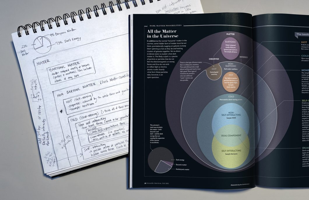
- Separate out the entwined concepts of dark energy, the cosmological constant, and vacuum energy, illustrating each and showing how they’re connected.
- Introduce people to the idea of percolation theory. A simple mesh-network example demonstrates that in order for any two phones to communicate, they need to be linked by a chain of other phones.
- Show how an artificial leaf made of silicon nanowires works. In a process similar to photosynthesis in natural leaves, it transforms photons into storable, transportable fuel.
Keep Context in Mind
Content is usually pretty clear. It’s the information to be visualized, as articulated in your goal statement. Context is equally important, but it’s too often neglected at the start of a project. What tools will be used to make the graphic, where will it appear, who is the audience (and what’s the designer’s relationship to that audience), and when does it need to be completed? All of these factors shape decisions related to what pieces of the content are critical to include, and how it should be presented. (Creative director Kelly Krause has written about how this dynamic plays out in the journal Nature, which features original journalism, opinion pieces, expert analysis, and peer-reviewed research papers. Graphics for each of those article types gets a different treatment, despite appearing in the same publication.)
Some of these factors are more regimented than others. For example, the destination for your graphic might dictate the size and format. (A magazine may provide you with very clear dimensions and file-type instructions.) Other variables—like the intended audience and accessibility measures—are more complex and less prescriptive.
I recommend describing key variables about the context, including:
- Where will your image live? The answer to this question will inform decisions related to both content and style, as well as the dimensions of your graphic (and therefore the composition).
- Who is the target audience, and what is your publication’s relationship with that audience? (For example, are the content creators specialists or nonspecialists? And is the audience made up of kids, adults, specialists, nonspecialists, etc. ?)
- Given the outlet and audience, what tone or vibe feels appropriate? The answer to this question—along with the subject matter—will inform decisions related to rendering style and illustrative details.
Revisit your goal statement after answering those questions, to make sure that the content you hope to convey still feels suitable for your outlet and audience.
Remember That Building a Graphic Is a Process
You can’t expect graphics to emerge fully formed right before the press date, in a single go. With some forethought and structure, you can set up your graphics-building process to dovetail with the stages of your larger project, so that the graphics can be properly reviewed by others in context.
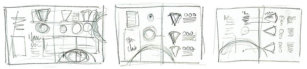
I recommend starting out with lots of fast low-risk doodles, experimenting with different ways to organize the information. There’s something freeing about taking a pencil to paper and simply scribbling out ideas. Pencil sketches are fast, foster an exploratory mentality, and are low risk. And as written by Bang Wong and Rikke Schmidt Kjærgaard in a 2012 Nature Methods column, “Making quick sketches or doodles as a way to rationalize information can expose gaps in our thinking and lead to alternative conclusions and new ideas.”
After you’ve narrowed in on a solution that you’re happy with, you can shift from exploration mode to presentation mode, and make things more intelligible for your collaborators. At this point, I find it helpful to break the process up into three formal segments: concept sketch, tight sketch, and final graphic. Consider dovetailing those steps with other deadlines for your project, such as text revision and editing deadlines.
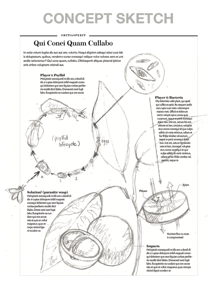
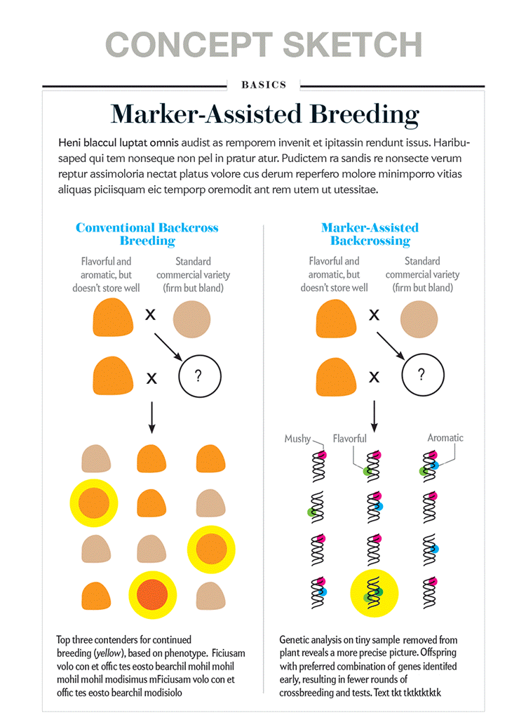
- Concept sketch: Create a frame that matches the absolute dimensions of your final product. Use your doodles as a guide, and transcribe that information into the larger frame. Include preliminary captions (or placeholder text) and labels, so that you remember to actively design them into space, and you are considering how they’ll relate to the imagery from the start. Introducing color may be useful at this stage, especially if you hope to use color to encode information or to guide the reader’s eye. This might mean making the most important elements stronger, with bolder outlines and more-saturated color than less-important, contextual elements. But the primary focus should be on composition.
- Tight sketch: If the feedback from collaborators on the concept sketch is relatively minor—and pertains to details within the larger plan—it’s time to develop a tight sketch. Correct errors and sharpen the details. It may be useful to introduce color at this stage, if you haven’t already done so. If you’re responsible for writing the captions, refine them now, too. If someone else will be writing them, this is a good time to check in and ask for updated text. Pay special attention to color, text, and label position, and the developing rendering style at this stage.
- Final graphic: Correct errors and finalize the rendering style, including color. Pay special attention to how labels and other text elements are interacting with the imagery. Are labels legible? Refine leader lines and double-check alignments.
At each of those three benchmarks, I recommend sending your visual out for review by collaborators (including a content expert), with specific questions related to what type of feedback you’re hoping for at each stage. For example, at the concept-sketch stage, I’m most interested in making sure that I’m getting the big picture right. No need to focus on aesthetics at that stage. Feedback should focus on whether the information, and the path through that information, is useful, clear, and accurate.
By working through these stages, with concept sketches that start as broad-stroke composition guides that are deeply rooted in the concept being explained, I find that I’m forced to really think through the content before getting distracted by drawing details. It’s not unusual to revisit the concept sketch a few times before getting the content right. Big-picture change requests may undermine the composition that you’ve already developed. Resist the temptation to quickly paste revised sections into the frame over the older, incorrect, or previously unclear portions of your sketch. Yes, it’s a pain to backtrack and rethink your goal—and the composition of your graphic—based on new information, but it’s best to sort that out before moving on to the tight sketch. Taking the time to thoughtfully address feedback at the concept-sketch stage should set things up for a smooth progression through the remaining steps.
Clarify, Don’t Simplify
More often than not, scientific content is complex. And the research papers that describe it can be dense. If you try to strip away that complexity, you’re at risk of producing either an oversimplified primer graphic that doesn’t really present the latest findings, or a graphic that shows the latest discovery without proper context for folks new to the topic. I find it more productive to focus on clarifying, not simplifying (with a nod to designers Nigel Holmes, Alberto Cairo, and others who have spoken and written about this idea).
The goal is to make complex and specialized information accessible to your audience. With an eye to clarity, approach the project as a translator, or a guide. Don’t water the information down. Rather, focus on knocking down barriers of entry, and beckoning the reader in. I find these three strategies useful when it comes to providing nonspecialist readers with the context they need in order to better understand the latest development:
- Annotate the primary source material directly, in plain language. Press releases and academic publications often include key visualizations that highlight the latest development. A few labels can go a long way in helping with reader comprehension, and helping folks better understand the image’s significance. If you choose to present an academic chart to a nonspecialist audience, think about how annotations and labels can help walk a reader through the critical takeaway points.
- Fold background information into the main graphic. Sometimes a few explanatory annotations aren’t enough, and another layer of information is necessary. For example, it may be helpful to include two views of the same scene. The “before” view may be an illustrated microscopic view of a healthy lung; the “after” view may be the exact same vignette, after a viral infection. The healthy view provides baseline information, so that your audience can more easily grasp how the system has been impacted by the infection.
- Include a second graphic, in the form of a primer box. Torn between the need to provide background material and the desire to get right to it with information on the latest discovery? Consider breaking things down into two—or more—independent graphics. A primer box can introduce basic concepts to readers who may need more context. Readers more familiar with the topic can jump straight to the new stuff. (Most particle physics stories, for example, could benefit from a table of particle types.)

Jen Christiansen is the author of Building Science Graphics: An Illustrated Guide to Communicating Science through Diagrams and Visualizations (CRC Press) and the senior graphics editor at Scientific American, where she art directs and produces illustrated explanatory diagrams and data visualizations. Christiansen presents and writes on topics ranging from reconciling her love for art and science to her quest to learn more about the pulsar chart on the cover of Joy Division’s album Unknown Pleasures. She holds a graduate certificate in science communication from the University of California, Santa Cruz, and a BA in geology and studio art from Smith College. Follow her on Twitter @ChristiansenJen and Mastodon @ChristiansenJen@vis.social.